Benefits of visual reporting


| We do a lot of our reporting in PowerPoint, which is a tool I like using. However, it does often involve recreating data from other sources on a slide so it can be included in a deck. Over the years, I’ve noticed a shift towards more visual forms of reporting, like dashboards and slides. Slides lend themselves to graphical story telling far better than documents, and are good for the busy exec who wants to flick through the headlines without getting lost in the many pages of a PID or project plan. We all use a lot of words for our reporting, but if you’re trying to get your message across, making your reports more visual can make a difference. Here are some advantages to consider. Charts and graphs make your documents shorterCharts, graphs and tables make your documents shorter because you can say more in a small space. Visuals make your documents more concise and impactful, perfect for the busy senior manager who just wants to skim. Let’s face it, we all have information overload and busy brains, so the less work they have to do to understand the point, the better. Shorter documents reduce cognitive load and aid retention, so they might even remember the point next month!
Colours highlight statusYou’re probably familiar with Red/Amber/Green colour coding for projects. The judicious use of colour makes it easy to see status at a glance. That means execs can focus in on the projects that need management attention. Watch out for how you use colour though, to make sure your reports are accessible to all stakeholders: readers with colour deficiency or people who prefer to print content in black and white won’t automatically understand your statuses unless you use the words too. Data presents the factsWorried about how your sponsor might spin project status? If you present the facts in graphical format, that will support the narrative. Even if your sponsor says everything is wonderful, sharing (for example) the number of red/high risks or open issues is a way to draw attention to the fact not everything is going as well as it could. Data, in graphical format, leads to objective reporting. Having said that, I’m sure you’ve heard people say that you can spin data in any way. So make sure your sources are clear and that you report like-for-like measures month-on-month for comparison. Links to drill down into the data will show that you value transparency. If you want to get better at visual reporting, think about where the data is coming from and how you can present it. I got some amazing tips from the book Good Charts by Scott Berinato. It is an eye-opening look at how to position your data for maximum understandability and storytelling. As well as the analytical thinking that you’ll want to do before you present any data, it’s also worth brushing up your technical skills, whether that’s a quick PowerPoint course or making sure you know how to use all the dashboarding and customisation features of your project management software, so you can get the data out in a format that makes it easy to share and talk about. Lots of common project metrics lend themselves well to being presented visually: timelines, budget allocations, pie charts of risk ratings and so on. Why not experiment with what you can make more visual in your next project update? |

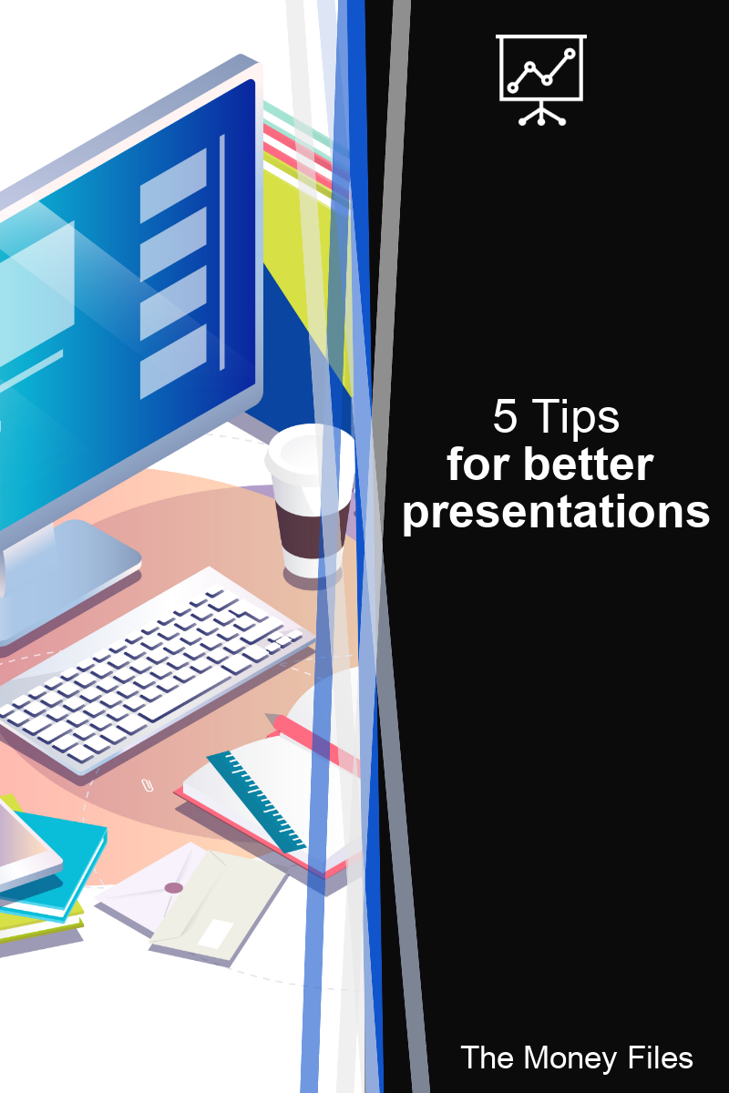
5 Tips for Better Presentations
|
Last month I shared some tips for using spreadsheets. Today I have some tips for presentations. I tend to use Microsoft PowerPoint, but all of these tips are relevant regardless of what presentation software you use. 1. Use iconsYou can make slides look so much better if you include a few icons scattered through in relevant places. Corporate slide decks (in my experience) tend to have lots of bullet points, so even if you add one or two icons you can break up the feel of large blocks of text. Note: Remember to respect copyright. Don’t download icons to use from the internet unless you specifically have the licence and rights to use them. Here’s an example of a slide that uses icons.
2. Use a big fontThe bigger the better! Anything less than 18 point is hard to read at distance. The best way to check if you can read the slide is to go to the room you’ll be presenting in and put the slides on the screen. Then you’ll be able to see (in real life) whether you are making it difficult for people to read your material. 3. Use a full-slide backgroundFull-slide backgrounds can make your slides look really good. Note: Slides that are predominately for use as training materials or to be read without you standing there talking through might be better off with more words. If you are able to talk about and explain the slides, you don’t need as many words on the slides – and a full-slide background can be a stylish way of presenting a few words on the screen. Here’s an example of a slide that uses a full-slide background. The image is the same as one of my book jacket.
4. Add an extra slide for a handoutIf you are distributing the slide deck, you can add in an extra slide at the end with more information. You wouldn’t show it within the presentation as you stand up and deliver it, and you can hide the slide from the presentation (in PowerPoint) if you want to. Or just stop clicking through the slides before you reach that one! Your final slide can then be an extra list of resources, an appendix, links or anything else that you want people to be able to refer to. 5. Rehearse with the software!It won’t be news to you that rehearsing is a good idea! However, you should also practice with the slides. Use your clicker, or practice moving the slides on with your keyboard or mouse. Check that any multi-media works e.g. videos or audio that you have embedded in the presentation. Check that you are aware of the slide transitions and builds. It’s annoying to watch a speaker either fly in all the bullet points in one go before talking about the slide, or finish talking and… oops!... there’s another bullet arriving covering a point they’ve forgotten about. If you don’t like using slide builds, take them out! What presentation tips do you have for putting together a great slide deck? Share your thoughts in the comments below! Pin for later reading:
|